 Retire Plan
what history actually did
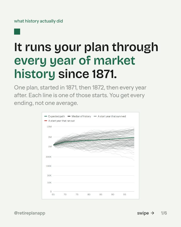
It runs your plan through every year of market history since 1871.
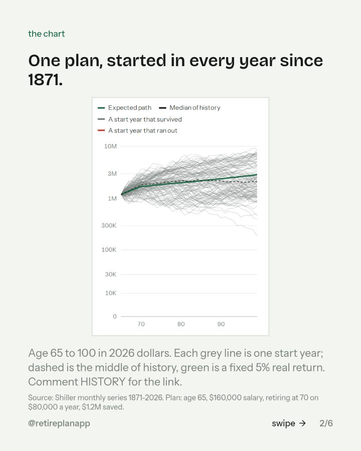
One plan, started in 1871, then 1872, then every year after. Each line is one of those starts. You get every ending, not one average.
You asked for the link. It is below: the slides from the post, the move if there is one, and the planner the chart came from.

Three things to look at first.
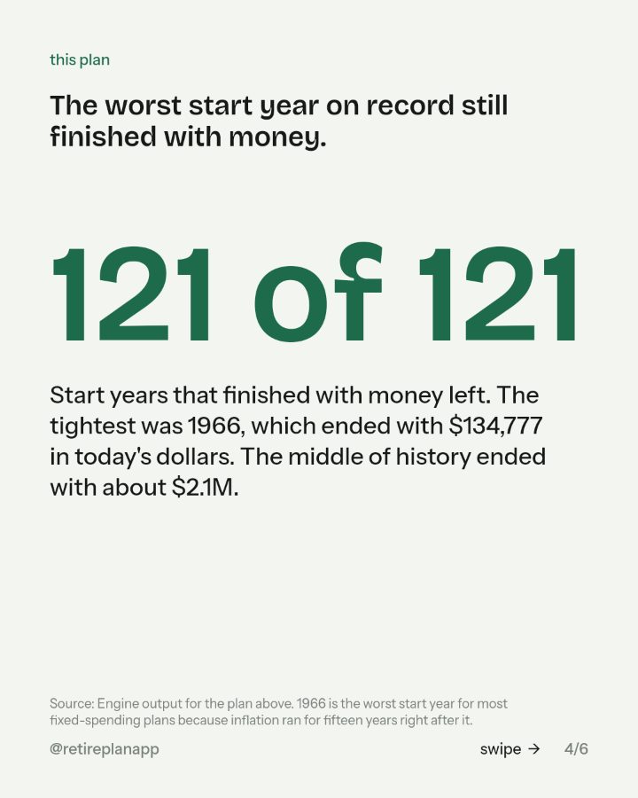
- 01The lowest grey line.That is the start year that treated this plan worst. Plan against it, not the middle.
- 02Any red line.Red means that start year ran out before the end. This plan has none.
- 03Where the green line sits.That is what a spreadsheet with one fixed return would tell you. Notice how many real lines sit below it.
Where to go next
Retire Plan
Type in one paycheck and it runs your plan through every year of market history since 1871, with the taxes worked out. About three minutes, in the browser.
Open itSources: Shiller monthly series 1871-2026. Plan: age 65, $160,000 salary, retiring at 70 on $80,000 a year, $1.2M saved.; Engine output for the plan above. 1966 is the worst start year for most fixed-spending plans because inflation ran for fifteen years right after it..